Defining Significance Tests

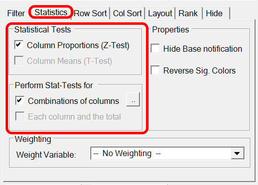
For both tables and charts, you can specify to perform T-Test and Z-Test. You can test all columns against the Total and/or you can specify which combinations of columns you want to test. In case you define a 'pairwise' test, it is possible to specify how you want significant difference visualized. When applying a significance test to a table or chart, the following window will appear.

This window also appears by clicking the  button. As you can see in the window, you will have to make a decision whether you want to do a 'Pairwise Test' or if you want specify a test combinations of columns. In case you do a pairwise test, we do not have to use significance characters and can use background or font colors to visualize significant difference instead. In case the final delivery is a PowerPoint presentation, you mostly want to do pairwise tests. The colors from Excel can automatically be visualized as significance arrows (or any other kind of shape) in the presentation. Read more about 'Color-Driven Icons' in PowerPoint.
If you just click 'Ok' to this window without making any setting, all columns will be tested against all other columns, which will be visualized using significance characters. It is also possible to define to compare e.g. the first 4 columns to each other and the next 3 column to each other. This is done by writing “ABCD;EFG” in the text field in the bottom of the window.
Note: Colors are shown in the first mentioned column, so 'BA' will test column A and B and change the background of the value in column B .The significance colors are defined in the 'Table Layout' settings.
Note: The method and confidence levels are set in Statistics Window.
Note: Per default, significance characters are displayed in superscript. This default setting can be deactivated in the 'Settings' window.
Here an example of the results of a pairwise test using fill colors:
